


October 16, 2026 12 min read
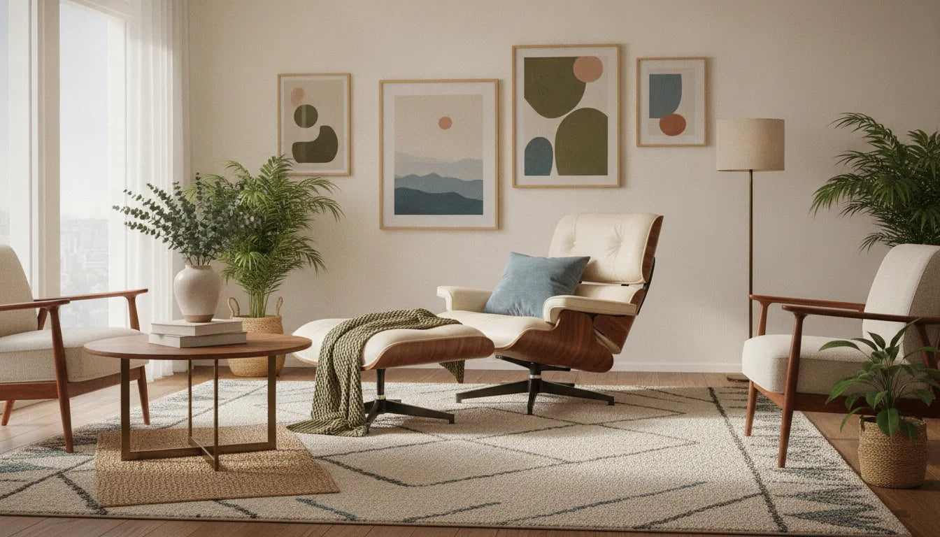
Brown furniture is easier to coordinate when you treat it as a range of undertones rather than one fixed neutral. Walnut and other brown finishes can lean warm, red, golden, or nearly neutral, and the right surrounding colors should support that character without competing with the grain.
Use Gingko's How to Buy guide for practical product guidance as you shape the room around the pieces you want to keep for years.
The best answer to what colors go with brown furniture depends on the furniture's undertone, the room's natural light, and the atmosphere you want. Soft whites, cream, muted greens, dusty blues, terracotta, and thoughtfully chosen neutrals can all work, but softened shades usually feel more integrated than pure, highly saturated colors.
Start by looking closely at the brown itself, then consider how its warmth or coolness changes beside your walls, upholstery, rug, and daylight. That undertone-first approach makes the palette more deliberate and leads to color choices that feel connected rather than merely matched.
The short answer is that brown furniture pairs well with softened neutrals, muted greens and blues, warm creams, and carefully chosen earthy accents. The best choice depends on the brown itself. A walnut cabinet with red or golden warmth will respond differently to a gray-brown sofa, and both will change again under cool daylight or warm evening lamps.
Look closely at the wood, upholstery, and nearby finishes before choosing paint or accessories. Walnut may show a blend of chocolate, amber, reddish, or olive notes through its grain. Upholstery can pull a piece warmer, cooler, lighter, or darker than the frame suggests. A rug, floor, or fireplace surround adds another fixed color that needs to belong in the palette.
For warm walnut, try colors with related warmth: soft ivory, camel, muted terracotta, olive, or a blue with a slightly green cast. If the furniture reads more neutral or gray-brown, dusty blue, soft sage, mushroom, and cool off-white may create a calmer relationship. These are starting points, not rules. Interior colors are generally softened rather than used at their pure color-wheel intensity, so a restrained version is often easier to live with than a highly saturated one. Color-planning guidance from the University of Nebraska-Lincoln also emphasizes considering existing furnishings when selecting a home palette.
View samples beside the furniture in morning light, afternoon light, and the light you use at night. A warm lamp can make beige look yellow and deepen brown; north-facing daylight may make the same wall appear cooler. If your room has clean lines and natural walnut character, a measured palette usually supports the furniture better than a collection of competing bright hues. These choices also align with the restraint and functional beauty described in Gingko's guide to mid-century modern design principles.
Start with the undertone, then compare value, light, and the finishes already in the room. That simple sequence makes the question of what colors go with brown furniture much more specific, and much easier to answer.
Brown furniture can support a surprisingly broad palette because it sits comfortably between color and natural material. The key is not to make every surface warm or every surface neutral. A room usually feels more considered when warm and cool notes, light and dark values, and smooth and textured finishes have room to interact.
Warm colors can make a space feel more intimate, while cool colors may help it feel more open and airy. That does not mean a blue wall will automatically make a small living room feel larger, or that a rust accent will always make it cozier. A study of imagined living rooms found that warm schemes received stronger ratings for excitement, while cool schemes were associated with more spacious and restful impressions. The same research also found that the room's spatial characteristics affected some responses, which is a useful reminder that color does not work in isolation. Read the study summary on PubMed before treating color psychology as a fixed rule.
In practice, brown wood can act as the warm anchor while a muted blue, blue-green, or cool gray introduces air around it. If the furniture already has a red or golden cast, cooler surrounding colors can provide balance. If the brown is deep and neutral, warmer upholstery or accessories may keep the room from feeling stark.
A palette needs variation in lightness as well as color. Interior-design guidance commonly recommends including light, medium, and dark tonal values, because a room made entirely of medium neutrals can look flat. Light walls or a pale rug can clarify the silhouette of a dark walnut frame. Medium upholstery can bridge the two, while smaller dark accents repeat the furniture's visual weight.
Light, room size, texture, and personal experience all affect how a color reads in place. Strong light-and-dark contrast can be especially striking, but a softer tonal range may be more comfortable in a quiet living room. The New Mexico State University color-planning guide offers useful background on these variables. For more ways to combine proportion, material, and color, explore these mid-century modern living room ideas.
Brown furniture is a useful foundation because it can lean warm, neutral, reddish, or nearly espresso-dark. The most successful palette depends on the undertone of the wood, the upholstery, the natural light, and the atmosphere you want in the living room. Interior color guidance also recommends choosing colors that blend with or enhance existing furnishings rather than selecting a shade in isolation (color-planning guidance from the University of Nebraska-Lincoln).
Use the pairings below as starting points, not fixed rules. Sample paint and fabric near the furniture at different times of day. A soft blue may balance an orange-brown finish, while the same blue can feel chilly beside a gray-brown piece.
| Pairing | Room effect | Best use or watchout |
|---|---|---|
| Cream or soft white | Lightens the room and gives brown furniture a clean, quiet backdrop. | Use for walls, rugs, or larger upholstery. Choose a warm white if the wood has golden or reddish undertones; stark white may look disconnected. |
| Muted blue | Introduces cool contrast and can make a seating area feel composed and restful. | Try dusty blue, slate, or blue-gray with warm brown. Very icy blue can emphasize the wrong undertone. |
| Olive or sage | Creates an earthy, settled palette that supports natural wood grain. | Good for accent upholstery, pillows, or painted cabinetry. Keep the green muted so it does not compete with the furniture. |
| Rust or terracotta | Builds a warm, layered room with a more expressive, collected character. | Use in smaller doses when the furniture is already orange-brown. Balance it with cream, pale wood, or a subdued neutral. |
| Blush or dusty rose | Softens the weight of brown and adds a restrained touch of color. | Choose a muted, grayed rose rather than a highly saturated pink. It works especially well in textiles and art. |
| Charcoal or black | Adds definition and a tailored, architectural quality. | Use with lighter walls or generous natural light. Too much dark color can flatten a small room. |
| Tonal tan or camel | Creates a quiet, enveloping scheme that lets grain, silhouette, and texture carry the design. | Vary the values and textures. Matching every brown too closely can make the room look flat. |
For a room that needs another layer of color without replacing its main furniture, explore Gingko's accent-chair collection as a source of seating and palette ideas. The goal is not to make every color match. Let the brown furniture anchor the room, then use contrast, texture, and repeated accents to make the palette feel intentional.
Wall color should support the furniture you already own, not compete with it. Brown ranges from honey and caramel to deep espresso, while walnut may show warm golden, reddish, or more neutral notes. Start by identifying the dominant impression of the wood in your room, then consider how the wall will look beside upholstery, flooring, curtains, and metal finishes. Color planning works best when these existing surfaces are treated as part of the palette rather than as separate decisions.
Cream is a dependable choice for brown furniture because its softness can keep a dark wood piece from feeling visually heavy. Choose a cream with a similar warmth to the wood when you want an enveloping, traditional effect. A warm white can create a brighter contrast while still feeling connected to golden or reddish brown. If the furniture reads neutral or slightly cool, a cleaner white may look more balanced than a yellowed cream.
Pure, high-saturation color is rarely the only option for an interior. Softer, muted versions tend to integrate more gracefully with furnishings and are easier to live with over time. See these natural materials and calm palettes for another restrained approach to combining color and texture.
Muted blue can bring cool contrast to warm brown, especially in a room with strong daylight. A dusty blue-gray is usually more forgiving than a bright, saturated blue. Soft sage, olive, or gray-green can connect brown furniture to plants and other natural materials without turning the room into a theme. Pale taupe, mushroom, and soft gray are useful when you want the furniture to remain the focal point.
Light changes the result. Paint a large sample or place several oversized swatches on different walls, and view them in morning, afternoon, and evening light. Check each sample beside the furniture and adjacent surfaces. Oklahoma State Extension notes that warm and cool colors can affect how a space is perceived, but there is no universal best wall color. The most reliable choice is the one that works with your wood's undertone, the room's light, and your own preference. Read the color-planning guidance before committing to a full wall.
Once the larger palette is working, accent color should add character without competing with the furniture. Brown and walnut already bring visual weight and natural variation, so a few deliberate accents usually look more composed than a room filled with unrelated bright objects. Start by choosing one accent family, then repeat it in different materials rather than using the same color everywhere.
Pillows are an easy place to test a richer blue, olive, rust, or another shade that relates to the room's undertones. Pair a patterned pillow with one or two solid colors so the arrangement feels collected rather than busy. A rug can broaden that accent across the room, but it does not need to match the pillows exactly. Look for a shared undertone or a quieter version of the same color.
Art can introduce a sharper note because it sits away from the furniture and can be changed without replacing a major piece. If the room already has colorful artwork, pull one restrained shade from it for a pillow or small accessory. This creates a visual connection while leaving the walnut grain visible as its own focal point.
The familiar 60-30-10 approach can help you think about proportion: a dominant background, a supporting furniture or textile color, and a smaller accent. Treat it as a flexible planning heuristic, not a decorating law. In a room with substantial brown furniture, the accent may work best closer to the smallest share. In a light, simple room, a colorful upholstered chair or larger rug may reasonably take more visual space.
Before committing to upholstery, view the fabric beside the actual wood in the room's daylight. Gingko's mid-century modern furniture style offers a useful reference for balancing clean lines, natural material, and a focused palette.
Review Gingko's How to Buy guidance when you are ready to compare furniture options at your own pace.
Once the main brown piece is in place, build the room outward in layers rather than choosing every finish at once. Start with the largest visual fields, then add texture and smaller accents. This keeps walnut or other brown wood from feeling either isolated or visually heavy.
Begin with the rug, since it establishes both the color field beneath the furniture and the scale of the seating area. A quiet cream, oatmeal, muted blue, or softened green can create useful contrast without competing with the wood grain. Choose a pattern only after considering the grain and silhouette of the furniture. If the table or casework has a strong natural pattern, a restrained rug often gives the room a calmer foundation.
Next, place the primary upholstered piece and check its relationship to the rug. Upholstery can bridge the difference between a dark wood frame and lighter walls, but it does not need to match the rug exactly. Repeat one undertone or a small accent color instead. For example, a mineral neutral can connect warm brown furniture to a pale rug, while a deeper blue or green can provide one deliberate point of contrast. When a current product page verifies a particular frame, fabric, or finish, treat that detail as specific to the item rather than a rule for every Gingko piece.
With the floor and upholstery settled, add plants, art, and accessories at different heights. A plant can soften a hard corner, while artwork gives the wall a visual counterweight to substantial furniture. Keep accessories selective: a few objects with varied shapes and surfaces usually make the wood more legible than a crowded arrangement. Natural materials and quiet finishes work especially well when the goal is a composed, contemporary living room.
Use proportion as the final check. A small accessory can disappear beside a large sofa, while too many large objects can make circulation feel tight. For more guidance on balancing walnut furniture, upholstery, and room scale, see these mid-century modern living room ideas. If you are still choosing the anchor pieces, the furniture buying guide can help you choose furniture that lasts, and the Gingko walnut living-room furniture guide offers additional brand context. You can also compare seating and other pieces in the accent-chair collection without committing the room to a single decorating formula.
Color swatches are useful, but they cannot show how a palette behaves beside the grain, upholstery, and changing light in your living room. A short testing process helps you move from a pleasing idea to a combination that works with the furniture you already own. It also respects a basic planning principle: colors should blend with or enhance existing furnishings, rather than being chosen in isolation.
Keep the samples in the room for a full day if possible. If the combination still feels comfortable across different light conditions and from the usual seating positions, it is more reliable than a color chosen from a screen. For another practical check, browse Gingko furniture alongside your samples and consider how a prospective piece would relate to the palette, scale, and daily use of the room.
Start with warm white, cream, muted green, soft blue, or another color that relates to the furniture's undertone. Use the room's natural light as a guide: pale colors can open a darker room, while deeper, softened hues can make a bright room feel more grounded. Repeat the chosen color in at least two smaller elements, such as a rug and pillows.
A dark brown sofa pairs well with lighter walls and textiles that create contrast without feeling stark. Try warm white, oatmeal, pale blue, sage, or muted terracotta. If the sofa has a red or golden cast, choose accents with a similarly warm bias. If it reads cooler, balance it with cream, olive, or dusty blue rather than adding many saturated colors.
Either approach can work. Lighter walls make brown furniture stand out and often help a compact room feel more open. Darker walls create a layered, enveloping effect, but they need enough lighting and contrast in the rug, upholstery, or accessories. Test large paint samples beside the furniture before committing.
Choose one main accent and one supporting neutral instead of introducing several unrelated hues. Look at the wood grain, upholstery, rug, and existing artwork together, then repeat the accent in small doses. A restrained mix of green, blue, rust, or ochre can add character while allowing the brown furniture to remain the room's visual anchor.
Place fabric, paint, rug, and finish samples next to the furniture and view them in morning, afternoon, and evening light. Check the combination from the room's main seating position, not only in a store or on a screen. Keep the options that look balanced beside the actual brown tone, then remove any sample that competes with the grain or upholstery.
Once you have a color direction in mind, seeing the furniture, finish, and surrounding tones together can make the next decision easier. Browse Gingko Furniture's living-room pieces and get started with the How to Buy page for straightforward product guidance. Take your time comparing proportions, materials, and colors so the final room feels considered and comfortable.